August 20, 2014

Morpholio Board 2.0: Your New Favorite Design App

Well this looks interesting....Have you guys heard of the Morpholio Project? According to their website it's "a group of applications that reinvent creative processes for designers, artists, photographers and any imaginative individual.....The Morpholio Project is both a set of utilities as well as a vibrant community." I hadn't heard of Morpholio before, but received a press release announcing the launch of their newest app Morpholio Board 2.0 and it looks to me like this one is poised to be the 'Next Great App' that will change the way we design.

If that sounds like a lofty statement, it seems the rest of the design world agrees; The app has recently been touted in design publications Elle Decor and Interior Design, among others. House Beautiful says "Warning: This new app is seriously addictive."


Seriously, this is a game changer on many levels. Unfortunately, as of this writing it looks like the Morpholio app is available only to Apple Ipad and iOS users, which leaves me, my Android phone and my laptop out of play. Anybody want to send me an IPad?! I'm super excited to try it out (when I borrow my friend's IPad) and I think anyone who has any interest in design on any level needs this app. There are so many features that put creativity literally at your fingertips, too many for me to cover here, so don't take my word for it....here is what others have to say about Morpholio Board 2.0:


So now if anybody says "May the Force Be With You," now it is, at least creatively. And if anybody has any experience with the app, I'd love to hear your thoughts on it! 


August 17, 2014

What I 'Chairish' Most

Okay, time to grind the gears back in motion! I haven't been blogging much, but I always like to think I'll get back to it soon, so when I was contacted by Chairish with an interest in having me create a style board around a piece of furniture, in this case one of their accent chairs, it was a perfect reason to dive back in.

You guys know about Chairish, right? I'm sure you do, but just in case you don't, it's a fantastic full-service site dedicated to helping you buy and sell amazing curator-approved finds for your home. What does that mean? Well, it means they've done the legwork for you in sourcing pre-owned, gently used items in great condition.  I first heard about Chairish through designer Emily Henderson's blog.  You know how designer types are always changing up their decor and/or hoarding those great flea market finds? Well, sometimes they need to make way for the next look or great score, so they head to Chairish to list the items they no longer need (or have room for!) Imagine the thrill of scoring your best Craigslist find ever....it's like that, but 100 times better! Seriously, you could furnish an entire room in under an hour with the things they have listed. Everything from James Mont to Jonathan Adler, Mid-Century to 80's Glam, architectural fragments, accessories galore, pillows! rugs! mirrors! You get the picture (and yes, they have artwork too.) All at fair prices, and with a 48 hour return window, so in the odd chance that French arched window doesn't fit because you forgot to measure for ceiling height, well you're covered.

My challenge in creating a style board was to imagine a plain white space and make it bright and colorful using my favorite accent chair from the Chairish site. Because they have so much to select from, I had a hard time narrowing down my choices to just one style board, so I created two! Here are a few.....or 50!....things from their shop that I love.


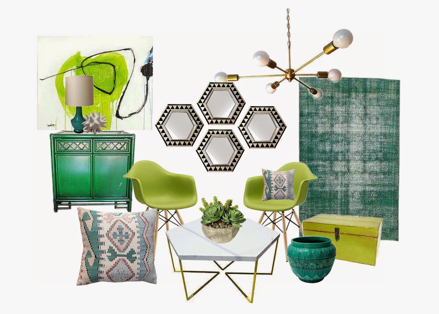
Using this green Eames style chair as a jumping off point, my first board features Green as the star of the show.


I'm a big fan of mixing elements of different styles together. I like to refer to it as Mid Century Moroccan or Modern Ethnic design, a look I use extensively in my personal space. I'm loving the fresh mix of green and blue-green hues here; It's both refreshing and soothing at the same time. I totally dig this room and would install this in my own home in two seconds flat!


.....


 If you follow Chairish on social media, you'll see they will often post a pic of an unfurnished white room with HUGE potential and ask #whatwouldyoudo? with the room

This was the latest installment

Gorgeous, right? Man, I love the 'Barn' feel of this, with those wide plank wood floors, high pitched peaked ceiling, and wide door opening. With a blank canvas like this, you could go in sooo many directions, but since I love color and the challenge was to take a room from white to bright, I chose an ultra-saturated purple chair and pictured it in that awesome space as my inspiration.


This fab armchair by Safavieh had me at Purple.Cotton.Velvet! In addition to many, many vintage finds, there is some newer merchandise offered as well, so it's always worth entering a current brand name in the search bar to see if your favorite maker is listed. Just a little tip ;-)


I rose to the #whatwouldyoudo? task with this style board, using that gorgeous purple chair to inform my other choices, and I must say I'm a little jealous of this room and wish I could live in it! Again, mixing modern elements with international accents is a look that really works for me and taking a room from white to bright is easy when you have color like this to work with.


So you see, you really could furnish an entire house using all items from the Chairish site. What are you waiting for? Go check them out! You just might find that perfect, one-of-a-kind element you're looking for to make your space uniquely yours. Enjoy!


disclaimer:I was contacted by Chairish to write a post, all opinions/product choices are my own.

April 20, 2014

Happy Easter!


Multi Cultural Easter Brunch table in fresh Pinks, Greens and Blues. Ikat table cloth, Greek key runner, my favorite Turkish Kutahya bowls, Moroccan salt cellar and tea glasses, vintage Mexican tin taper holders, MidCentury pink crackle glaze ceramic vase, vintage jelly glass and American FireKing Jadeite all meld together for a casual, eclectic and inviting tablescape! ♥ Wishing you all peace, love and contentment this Easter.

July 27, 2013

West Elm Pattern Palette Design Contest on Olioboard

Hi Friends! So, Olioboard is at it again....teaming up with fantastic sponsors to allow Olioboard users/creators to design a room featuring the sponsor products. Well, when I saw they were partnering with West Elm in what they are calling 'The Pattern Pallette Design Contest' I was super excited to throw my hat in the ring! I LOVE West Elm! Their products are so modern, yet so timeless. And Olioboard is my go to site to create mood/project boards for a potential look. I'll never forget the first time I heard of Olioboard and posted about it here.

Well, the contest is in full swing, and man did this one bring the talent! There are some super fantastic looks going on over there...you don't want to miss it! There are only 8 days left to vote, so get on over there and show some love!

Like I said there are many, many, many really terrific boards in this contest, so I wanted to share a *few* with you here. I really wish I could share ALL of them, but there are, as of right now, 52 pages and counting of talent to scroll through, so here are a handful of entries, in no particular order.

 Love this graphic, simple board by Olio community member konstadina


Love the Pink! By member laurajean


 Neutrals with a hit of bold pattern...bullseye! By addedcharm


 A well edited, sleek look and I adore the blue. By member mpricedesigns


 Super cool and moody...kinda mysterious. The dark backdrop is daring and perfect! By grahamssister


 A Mid Century Moroccan vibe...I dig it! By community member marialuisalim


 Silver and Yellow Hollywood Regency look...nice! By lolasty


 It's the artwork and the clean, streamlined mix of items I like here. By community member catsinboxes


 Loving the stripes and the mix of vintage architecture with modern elements. By redoitdesign


I really get the 'collected over time' feeling looking at this space. Beautiful! By member casalinteriors


 I wish I could actually create this room. The wall of books!The curtains!The bed! Created by designasauris


 Franz Kline artwork, a bold zig-zag pouf and clean lined simplicity. Spot On. By spectrumlrmetro


 A sweet little jewel box...a little glam, a little rustic. Me likey. By member lyndaonthehudson


 Nice mix of pattern and texture! by Olioboard community member thejen


 Love the watercolor backdrop and that fab pendant light. By Itchanel


 The depth is amazing and I love that string chair! By community member in2design


 Asymmetrical symmetry is tricky, but member michelerice pulls it off perfectly here!


Chill Out Lounge By agniq. I most definitely could chill out in this room for a good long while.


 Very cool downtown loft feel. Love that shot of color in the orange table. By swimen

A really nice mix of solids and pattern. By Olioboard community member netteart


Okay, did I tell you there were SOOO MANY AMAZING entries?! And this is just a sampling of them...you really have to go to Olioboard and look at every page and see them ALL and be sure to vote for all that amazing talent!

I will leave you with one of my own entries in the contest (I have two boards entered.)
 Have fun, but don't blame me if you wind up spending hours looking at all the beautiful rooms!


July 16, 2013

Goodwill Goods::Art Glass

Hi everyone! It's been a while, but I have another installment of my Goodwill Goods series. Remember the post I did about my Goodwill finds here? I could probably do a whole years worth of posts just on the stuff I find at thrift stores! I am waaaay behind in sharing all my discoveries, so this is just my 'latest' find.

I love Art Glass and all my drinking glasses were/are collected over time, not bought as a set. Some Art Glass can be soooo expensive though, so I am always looking for 'friendlier on my budget' versions. I wrote about that here. I use art glasses as my everyday drinking glasses, so inevitably one gets broken here and there, but that's okay because I always seem to find one or two whenever I'm out and not really looking for them. This is one of my favorites so far, found at Goodwill.


 For only $1.99!

So hard to capture in a photograph, the different colors each have their own iridescent shift which change colors as you tilt the glass. Soooo pretty!

Can't read the signature, but the date is 1997. I go to the Sawdust Festival in Laguna Beach every year and there are a few glass artists there whose booths I make sure to visit. I occasionally will splurge and buy one of their glasses, which look exactly like this one, signed and dated by the artist, and generally cost anywhere from $35 to $50 per glass! Very well worth it for the skill that goes into it, just not in *MY* budget very often!


It's not like finding a Picasso at a garage sale, but I'll take a buck .99 art glass signed and dated any day of the week! It's finding joy in those little things :-) What have you found lately?


July 11, 2013

One Kings Lane goes to Morocco!!

Oh wow you guys, I LOVE the Moroccan influence in design ( seen here here and here) and starting YESTERDAY (means You better hurry!) One Kings Lane launched THREE Moroccan themed sales!! They end TOMORROW, so get over there and prepare to drool over all the Moroccan look loveliness.

A Table In Tangier Sale
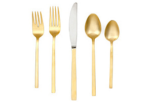
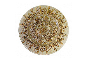
Move yourself (and your table) to a distant land with this collection of intricate Moroccan-style tableware. Outfitted in shining gold, stunning prints, and saturated hues, this array of glassware, linens, and more will take you on a trip you'll never forget!


Shop The Souk Sale
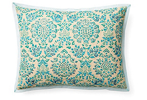
Escape to Morocco without ever leaving your home. Pore over exotic rugs, pillows, and accent pieces, from painted jars to glass lanterns, to bring a touch of alluring Marrakech style to your living room, bedroom, or den.


Marrakech Nights Sale
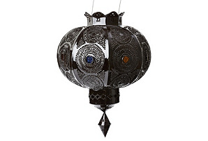
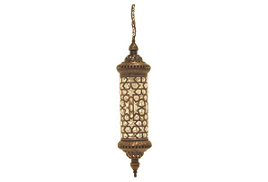
For an exotic, romantic glow, I can't get enough of these Moroccan-inspired lanterns and lights. Their intricate cut-metal patterns cast light into eye-catching shapes, but they're just as beautiful left unlit. Discover easy ways to decorate with these dazzling lights below.


 Hop on over, but hurry...It's all over tomorrow! Have fun and send me a postcard!


 Disclosure: I am a member of the One Kings Lane affiliate program. This is an affiliate sponsored post, all opinions are my own.


July 4, 2013

Guest Post at Lamps.com

Hi All! Happy Fourth of July! Hope you all have some fun plans for today. I will be heading out later to see fireworks, my favorite part of Independence Day festivities.

Meanwhile, I wanted to share a guest post I wrote over at the lamps.com blog. I rounded up 10 of my favorite fixtures from their site. Check it out here! They are also offering a 10% discount code to all DesignShare readers! Just enter HAYESTONE10 at checkout to receive your discount. Sweet!

And last but not least, I created this moodboard using one of my favorite picks from the site. Hop on over there to see all the cool fixtures they have...enjoy!


April 22, 2013

Dot Ikat Flip Flop: An experiment in Reverse Fabric Painting.

I recently scored this vintage wire 'sofa' for a song on Craigslist, but it didn't come with any cushions. so I scouted around my house, rearranged some stuff and came up with a cushion for the seat. I always have extra throw pillows around, so that was no problem, but now I needed to make a slipcover for the seat cushion.


I didn't want to spend any money on this project, so I used what I already had on hand. And what I had was a bolt of a beautiful, purple, linen-cotton-poly blend, heavy weight fabric I scored at Hancock for around $3 a yard on a major, major clearance sale. I love the shot of color here, but it just looked too plain to me, somehow. It seemed like some kind of pattern was necessary. Well I have approx. 12 yards of this fabric, so decided I could spare some for an experiment.

You've all seen the reverse 'dye' technique of using bleach on dark colored fabric to remove the color....kind of like reverse tie-dyeing...I thought it might look kind of cool here, so I tested a piece to see how the color would 'lift' from this fabric. If you are thinking of doing this, I definitely recommend doing a test swatch first. Many fabrics, especially black and navy blue and most dark colors have really unexpected 'lift' results. I half expected this purple to lift to very orange, but was pleasantly surprised when it turned a really pretty pinky pale purply hue....say that three times fast!

I decided on a pattern and just started painting. 


A little while later.....
A fun, playful pattern!  I was happy with the result, but since the cushion is two sided, why not try something else on the other side, right? Having 12 yards of this fabric gave me the confidence of knowing if I messed up, I would have plenty left to start over.


I've been loving all the Ikat prints that are so popular right now, so decided to try simulating one.


Really easy to do, just back and forth brush strokes of varying widths. I found quick, loose strokes worked best for the look I was going for.

I really love how this turned out, too!! Problem is, now I can't decide which one I like better! I think for that room, the Ikat one works better with the other patterns that are in there, but then I like the softness the circular print adds to all the angles....but then.....hahaha! I just can't decide! Good thing I don't have to. Since it's two sided, I can flip the cushion whenever I feel like it!


DOTS

or

IKAT


What I learned:
Definitely do a test swatch to see if your fabric 'lifts' to a desirable color.

Use natural bristle brushes to paint on the bleach...synthetic bristles will get ruined by the bleach. I learned the hard way after ruining two really good brushes!

Make sure to wash your fabric after bleach painting. Let the bleach stay on the fabric for at least 45 minutes to get the max lift, then run it through a wash cycle to remove all traces of the bleach from your fabric.

So tell me, which one do YOU like better? Let me know! 


As always, thanks for stopping by today! See you next time.


Related Posts Plugin for WordPress, Blogger...