Happy Friday everyone! Today I talk about using familiar objects in different ways. To that end, I feature my kitchen back-splash made of glass vase filler or aquarium pebbles and a chandelier I made out of clothespins! I will be talking about that chandelier and how I did it in an upcoming post! Enjoy, and as always, thanks for stopping by!

January 28, 2011
January 27, 2011
Copy This!
I have been saying it for years....There is nothing original, all things are derivative. It's hard to say that as a designer because it sounds negative. But, it's actually a very positive realization that, I feel, gives a designer more freedom to design without false expectations of being original. Here is a quote that summarizes it all for me, to perfection. I couldn't say it better myself, so I copied it, naturally!

Authentically yours,


Authentically yours,

January 26, 2011
Style File part two...
Hi folks! This is the second of an on-going contributing segment on the channel 4 news at 4 with Martha Vazquez here in Tucson. This was supposed to air on January 10th, but because of the shootings, it obviously got bumped. So without further ado......oh and I'll be on again this Friday, Jan. 28th!
January 17, 2011
Quicksilver
I have never been a fan of gold. I have never worn gold jewelry and I never owned a pair of gold spandex pants! I can't explain why, it's just one of those things. I think gold is pretty and I admire when other people wear it or use it in decorating, but when it comes to my own style, I have never even considered it. So instead, I choose Silver! And frequently. Everything in my home has some touch of silver to it, including all of my 60+ mirrors! You can read my previous post about Silver Love here. In the past, my use of silver has been limited to accents,
But more recently, I have considered using it for larger pieces, like,say, the whole couch. I can't tell you how excited I was to have been combing the Joanne's bargain remnant rack, when I discovered about 10 yards of a silver foil vinyl!!
 The price per yard was not quite the "bargain" it was advertised as, so I pointed out some flaws in the finish and talked the price down to $4 a yard. I took it home and "sewed" together a slipcover for a bench similar to the picture above. When I say sewed, I really mean glued. The vinyl was way too thick for my sewing machine, so using industrial strength spray adhesive, I turned the edges under and constructed a fabulous, shiny, gleaming silver slipcover for my living room! It was glorious!!....for about two days. Wah Wah Wah...I quickly understood why the vinyl had been on sale. The foil began peeling away from the backing, leaving bubbles in the surface of the cushion, which eventually began 'popping', leaving all too tempting holes for little fingers (my kids!) to poke in and peel away the foil, leaving what looked like an exploded mylar balloon all over my living room.

It was a disaster! But I'm really most upset that I didn't get any pictures of the finished product, because it really was spectacular, and exactly what I had envisioned, even if ever so briefly.
After this experience, I googled 'silver couch' and was delighted to find so many beautiful images of gleaming goodness dancing before my eyes! There is a whole world of silver furnishings I never knew existed. Some things, like the Moroccan pouf, were expected, but this was just about the cutest use of one I've seen:


 Georgeous, right? Am I alone in my love of silver furnishings? Based on these images, I don't think so! I haven't given up hope of reconstructing my silver settee, I just need to find the right material. I am fully confident I will, because (you know I have to say it!) every cloud has a SILVER lining!
gleamingly yours,


 |
| like this silver pillow. |
But more recently, I have considered using it for larger pieces, like,say, the whole couch. I can't tell you how excited I was to have been combing the Joanne's bargain remnant rack, when I discovered about 10 yards of a silver foil vinyl!!


It was a disaster! But I'm really most upset that I didn't get any pictures of the finished product, because it really was spectacular, and exactly what I had envisioned, even if ever so briefly.
After this experience, I googled 'silver couch' and was delighted to find so many beautiful images of gleaming goodness dancing before my eyes! There is a whole world of silver furnishings I never knew existed. Some things, like the Moroccan pouf, were expected, but this was just about the cutest use of one I've seen:
 |
| Photo courtesty grahamandgreen.com |
And these examples just leave me wanting a silver couch more than ever!

gleamingly yours,


Thanks for visiting! Please consider becoming a follower!
January 9, 2011
In Honour and Memory.....

...of those who were killed and wounded
Tucson, Arizona January 8th, 2011
He who has gone, so we but cherish his memory, abides with us, more potent,
nay, more present than the living man.
~Antoine de Saint-Exupery
~Antoine de Saint-Exupery
He spake well who said that graves are the footprints of angels.
~Henry Wadsworth Longfellow
January 7, 2011
Before and After
L. Rudolph is a hard working, stylish woman with great taste of her own and a penchant for the best things in life. She already had some terrific pieces of new and vintage furniture, and some architectural interest in her southwest bungalow style home. She was tired of the existing colors though, and wanted a more subdued, clean, yet elegant look to her great room. Using her existing furniture, we re-worked the layout and changed up the paint and tile to great effect.

Before was a yellow wall with blue Mexican tile. L. had lived with the tile for seven years and was just sick of it.

 So starting with paint, we covered the yellow with a beautiful warm gray color called 'Tarnished Silver,' made by a local studio. I had in mind wide horizontal stripes to help visually widen the room. I suggested the idea to L., and she was very receptive!


I custom mixed a lighter color of the gray to provide a low contrast presentation. It instantly changed the look of the room into that of a hip, uptown loft, even though this is a stand alone dwelling. Now we needed to deal with that blue tile, which also encased her hearth and fireplace surround on the other side of the room.

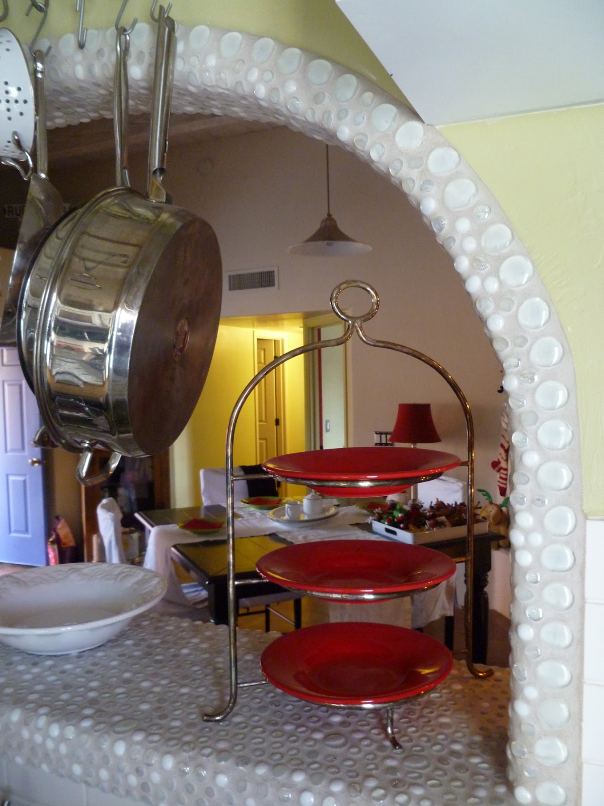
I decided to simply work over the existing surface and execute a technique I have used many times in my own home, as well as that of others. Using ceramic tile adhesive, I proceeded to glue glass craft pebbles right on top of the tile. Since I chose clear and white glass, I primed the tile first so there wouldn't be any blue showing through the back.


The process worked brilliantly, and the whole room was completely transformed. After grouting each area and clean up, I left Ms. Rudolph to enjoy her new space. She was excited to share her beautiful new great room with her daughter, who would be visiting from afar later that week!


I am very pleased with the way it turned out, and hope it gives L. many years of enjoyment!


Before was a yellow wall with blue Mexican tile. L. had lived with the tile for seven years and was just sick of it.


I custom mixed a lighter color of the gray to provide a low contrast presentation. It instantly changed the look of the room into that of a hip, uptown loft, even though this is a stand alone dwelling. Now we needed to deal with that blue tile, which also encased her hearth and fireplace surround on the other side of the room.

I decided to simply work over the existing surface and execute a technique I have used many times in my own home, as well as that of others. Using ceramic tile adhesive, I proceeded to glue glass craft pebbles right on top of the tile. Since I chose clear and white glass, I primed the tile first so there wouldn't be any blue showing through the back.


The process worked brilliantly, and the whole room was completely transformed. After grouting each area and clean up, I left Ms. Rudolph to enjoy her new space. She was excited to share her beautiful new great room with her daughter, who would be visiting from afar later that week!


 |
| This co-ordinates BEAUTIFULLY with the poured concrete counter top! |
I am very pleased with the way it turned out, and hope it gives L. many years of enjoyment!

Civano Community School
The Civano Community School is a charter K-8 school in which the parents are actively involved in curricular activities, descision making, fundraising and outreach programs. Because of that nature, parents were often found congregated in the school entrance well after the class bell had rung, usually discussing some topic related to school events, but often time just simply chatting and catching up with each other. A regular parents coffee morning was organized, but the main entrance square was sorely lacking any kind of comfort or ambiance. The teachers decided, since the parents are such an integral part of the schools success, to give them AND the students a place to gather, be comfortable and visit with each other.
Following are pix of the school as it was before.......

Basic........
 Boring............

Blah......
Working with a small budget, the teachers and staff asked me to design a space that would be comfortable and beautiful for parents, yet stand up to the rigors of everyday use by the students, not to mention the harsh desert conditions. I came up with solutions that pleased both the parents and the student body and really give the school a unique, beautiful and practical approach to everyday use.


 ....while painting the bike rack red brings it forward against the beige building, newly clad in horizontal corrugated metal.


A handmade glass and mirror mosaic sign hangs at the entrance, welcoming everyone as they start their day.
What I'm most proud of is the fact that not only did I design it, I personally executed every single element that went into this design, single-handedly, with kids in tow, in 108 degree heat during the student summer break. I procured all the supplies, I built the new half wall that serves as a backrest for one of the benches, I built the benches, I sewed all the banners, cushion and pillow covers, I hung the corrugated metal siding that runs the length of the building, I painted the mural, I did the mirror mosaic on the window surrounds, including cutting the mirror itself into squares and rectangles and I made the welcome sign using plywood, back painted glass and cut mirror. It was not an easy task, but I learned a great deal along the way and will be forever grateful for the opportunity the school provided me.

Following are pix of the school as it was before.......

Basic........


Blah......
Working with a small budget, the teachers and staff asked me to design a space that would be comfortable and beautiful for parents, yet stand up to the rigors of everyday use by the students, not to mention the harsh desert conditions. I came up with solutions that pleased both the parents and the student body and really give the school a unique, beautiful and practical approach to everyday use.

Using corrugated metal, outdoor fabric, paint and creativity the space is given a new life.


A simple mural gives a drab wall a shot of color and interest.....


A handmade glass and mirror mosaic sign hangs at the entrance, welcoming everyone as they start their day.
What I'm most proud of is the fact that not only did I design it, I personally executed every single element that went into this design, single-handedly, with kids in tow, in 108 degree heat during the student summer break. I procured all the supplies, I built the new half wall that serves as a backrest for one of the benches, I built the benches, I sewed all the banners, cushion and pillow covers, I hung the corrugated metal siding that runs the length of the building, I painted the mural, I did the mirror mosaic on the window surrounds, including cutting the mirror itself into squares and rectangles and I made the welcome sign using plywood, back painted glass and cut mirror. It was not an easy task, but I learned a great deal along the way and will be forever grateful for the opportunity the school provided me.

Austin Residence
The Austins are a fun, young family with two kids and pets. They needed a practical, easy to maintain and great looking approach to their interior living space.
What was formerly a very worn out Pergo floor is now beautiful,warm, polished concrete flooring. Virtually in-destructible, it hides dirt easily (perfect for busy moms!)and lends itself to the architecture of it's southwest location.


A great farmhouse table paired with modern chairs make sure there is plenty of room for family and friends to share a meal together.


Since the kids play piano and need to practice often, why not make the piano a beautiful focal point in the great room?

A cozy little sitting area in front of the fireplace. The graphic print on the arm chairs brings modern balance to the space.

View of the great room.

Leather furniture is super practical in a house with little creatures, whether two legged or four! The red brings a fun pop of color, complimented by the soft yellow on the back wall. All balanced out by a warm grey "wainscot" to ground the brighter colors.
January 6, 2011
A picture is worth....
As most of you already know, I was recently on the Nate Berkus Show, talking about low cost, high style design. I got selected for the show by clicking on the "be on the show" link on the Nate Berkus website. I had submitted several photos of my home, but my bedroom was the one they chose to focus on.
 |
| This is the photo I submitted of the bedroom.. |

 |
| All finished! |


 |
| starlight, starbright...... |

Hope you enjoyed the pix, thanks for visiting, come back soon!

Subscribe to:
Posts (Atom)
